I wonder what photos will be used in the booklet. Just Twin Peaks TV series or a mix of Twin Peaks TV and FWWM photos.
I wonder why they went with the artwork they did and not decide to tie it in with a Gold cover.
-B
Twin Peaks: New Season Two Music Soundtrack Track Listing
Moderators: Brad D, Annie, Jonah, BookhouseBoyBob, Ross, Jerry Horne
-
jdh.goodgrief

- RR Diner Member
- Posts: 187
- Joined: Mon May 28, 2007 3:39 pm

No, no... It's far worse!Jerry Horne wrote:It's as bad as the dvd box set at least.
Still, it's the content that counts! Happy to have this CD released nonetheless...
RR
Last edited by Red Room on Wed Sep 26, 2007 6:35 am, edited 1 time in total.
"Sometimes my arms bend back..."
http://www.fletchertronics.com
http://www.myspace.com/fletchertronics
http://www.facebook.com/olderthangod
http://www.fletchertronics.com
http://www.myspace.com/fletchertronics
http://www.facebook.com/olderthangod
-
FaceInTheLeaves
- Roadhouse Member
- Posts: 87
- Joined: Thu Feb 01, 2007 7:43 pm
Oh dear.
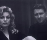
They get credit for using the original Twin Peaks typeface and two fantastic pictures but they could dispense with 'Music' from the top (or 'Season Two Music and More' from the bottom) because pointing out the album contains music twice is a bit excessive. It's like, I get the message, there's no need to shout. The only things I hate about the cover are the red band along the bottom and 'Music and More'. Calling it a 'collectors booklet' is a cheap trick because there's nothing collectible about a mass produced CD booklet, but bless them for making the effort. And 'Music and More' is ridiculous because unless it's packed with enhance content there's nothing more.
On balance it's not so bad. It didn't fill me with revulsion like the gold box did but they should have put one photo on the front and used less text. They're going to induce seizures.
If it wasn't taken from the official site I'd be convinced it was fan-made but the tracklisting's fantastic and they've included pictures, so my good will remains intact.
-
MysteryMan

- RR Diner Member
- Posts: 187
- Joined: Wed Sep 26, 2007 3:29 am
- Location: Glasgow, Scotland (UK)
I completely agree. This is the worst Twin Peaks cover image I have ever seen. Also the writing doesn't seem to appear correctly on the cover, for instance it says music all the way the left underneath Twin Peaks. It looks very amateurish. I am also slightly puzzled that the title seems to have changed somewhat, according to Amazon it is called "Twin Peaks: New Season Two Music"... But of course at the end of the day it is the content that matters and the track listing looks fantastic. One would have thought though that when such an effort is put into the track listing that the packaging would also look nice.
Here are some ideas I have with regards to what the songs can be:
01 Love Theme Intro 2:21 (I think this is the slow guitar instrumental version of "Falling/Twin Peaks Theme" heard in Ben Horne's slideshow or the scene with Nadine's suicide attempt, it makes sense to have this as the first song on the CD - something familiar, a tune that defines TP)
02 Shelly 2:17 (I would be surprised if this isn't the same song as "Shelly Quits")
03 New Shoes 3:48 (I suppose it is quite obvious which song this is)
04 High School Swing 1:51 (I am not 100% sure on this one but I think it possibly could be the tune played in scenes when Nadine flirts with Mike, same song that is played when Cooper invites Annie out for a nature study)
05 Hayward Boogie 2:16 (Only song I can think of here is the piano tune played by Gersten Hayward (Alicia Witt) at the end of episode 2.01)
06 Blue Frank 5:10 (The song following 'The Pink Room' in the party scene in FWWM)
07 Audrey's Prayer 2:10 (the instrumental of 'Questions In A World Of Blue')
08 I'm Hurt Bad 2:30 (the tune playing from the jukebox in the pilot as Bobby escorts Shelly out of the Double R)
09 Cop Beat 1:56 (Not at all sure on this one; I am hoping that it could be something from FWWM; perhaps the Deer Meadow Shuffle?)
10 Harold's Theme 1:42 (This one is quite obvious I think)
11 Barbershop 1:25 (Wasn't sure of this one until I read about the mention of the Barber choir in episode 2.02, which sounds likely to be it)
12 Night Bells 2:47 (This one I am not so sure about; possibly something similar to "Night Life In Twin Peaks" from the first soundtrack cd, played during the more scary/creepy scenes)
13 Just You 3:36 (The song James sings with Donna and Maddy in the Hayward living room in episode 2.02; I hope it includes all their vocals and isn't just an instrumental)
14 Drug Deal Blues 3:08 (My guess is this song was played during the big undercover drug deal scene in episode 2.13, although I quite can't recall the music)
15 Audrey 2:26 (Perhaps the tune played when Audrey speaks to the Norwegians in the pilot?)
16 Josie and Truman 4:32 (I'm guessing on the scene from 2.17 where Truman is reminiscing his time with Josie)
17 Hook Rug Dance 2:24 (I think this one is quite obvious as well, and one of my favourite songs!)
18 Packards' Vibration 2:39 (I am guessing this song will be the tune played at the end of episode 2.11 where Catherine orders Josie to work for her)
19 Half Heart 5:31 (The "Love Theme" from FWWM played during Laura's first encounter with James; another favourite of mine)
20 Laura's Dark Boogie 5:01 (I think this will be the tune played in FWWM during Bobby and Laura's drug deal in the woods)
21 Dark Mood Woods / The Red Room 9:01 (This must be the strange, mysterious music played over and over in the last episode)
22 Love Theme Farewell 2:34 (I think this will be the piano version of Laura Palmer's Theme, perfect way to end a near perfect soundtrack album)
If all my predictions are correct the only songs I am really missing here are the ones played in beginning of episode 2.11 when James rides his bike heading out of town, and the music performed during the Miss Twin Peaks Contest (episode 2.21).
-
epsilonminus
- New Member
- Posts: 5
- Joined: Mon Sep 24, 2007 5:09 am
OMG !!! That cover art is more nauseating than the "throw-back" jerseys that the Philadelphia Eagles wore on Sept. 23. Three iconic images each overlaid on top of each other infused with a shimmering white light. That is hideous. As soon as I see something that bad I long to see the artwork that Ryko Distribution rejected in favor of this. Did some graphic designers actually submit artwork that Ryko judged to be "not as good" as this crap ??
That picture on Badalamenti's website when you click on "Shelley Quits" is so much better. Or why not a darkly lit perfectly composed portrait of Cooper, Laura, and The Man From Another Place all seated in the Red Room?? Or how about one of the great panoramic outdoor scenes from the series??
Who the hell does this? I mean, who designs crap like that?

-
jdh.goodgrief
- RR Diner Member
- Posts: 187
- Joined: Mon May 28, 2007 3:39 pm

I haven't seen anyone mention Lana's "Contortionistic Jazz Exotica" piece.....which I'm sure isn't being mistaken for the "Miss Twin Peaks" music...or have we all collectively decided to forget that piece? (Not seeing how anyone could, remembering Robyn Lively back in the day, but hey...)
Matteo
Matteo
Talk hard and make it count,
Matteo
myspace.com/morphiaflow
"The darkness must go down the river of night's dreaming, flow morphiaflow slow, let the sun and light come streaming, into my life..."
Matteo
myspace.com/morphiaflow
"The darkness must go down the river of night's dreaming, flow morphiaflow slow, let the sun and light come streaming, into my life..."

David Lynch, for one. Don't know that he was involved with this but it's quite similar to his awful Inland Empire cover (overlaid images) and that "M U S I C" reminds me of his regrettable motel-type Eraserhead "2000" type treatment. I love David but perhaps graphic design should be left to professional graphic designers.bmiller wrote:OMG !!! That cover art is more nauseating than the "throw-back" jerseys that the Philadelphia Eagles wore on Sept. 23. Three iconic images each overlaid on top of each other infused with a shimmering white light. That is hideous. As soon as I see something that bad I long to see the artwork that Ryko Distribution rejected in favor of this. Did some graphic designers actually submit artwork that Ryko judged to be "not as good" as this crap ??
That picture on Badalamenti's website when you click on "Shelley Quits" is so much better. Or why not a darkly lit perfectly composed portrait of Cooper, Laura, and The Man From Another Place all seated in the Red Room?? Or how about one of the great panoramic outdoor scenes from the series??
Who the hell does this? I mean, who designs crap like that?
Edited to add: I heard/read that David was responsible for the Inland Empire covers. I don't know that for a fact. And I assume that he was involved and at least signed off on the Eraserhead cover.

David Lynch, for one. Don't know that he was involved with this but it's quite similar to his awful Inland Empire cover (overlaid images) and that "M U S I C" reminds me of his regrettable motel-type Eraserhead "2000" type treatment. I love David but perhaps graphic design should be left to professional graphic designers.
Edited to add: I heard/read that David was responsible for the Inland Empire covers. I don't know that for a fact. And I assume that he was involved and at least signed off on the Eraserhead cover.
I think I know which one of the many Inland Empire covers you're referring to. If it's the one I'm thinking of you're absolutely right. I purchased I.E. at Best Buy as soon as it was available and I got this cover art, which I really like. It's this one:
http://tinyurl.com/2uxeg3
I think the one you're referencing is the cover art displayed in image 5 of 6 at the above URL. Did David design all of the different I.E. cover arts??
